
Finding the Signal
in the Inbox
Redesigning how support agents prioritize conversations on a conversational AI platform.
- Role
- UI/UX Designer
- Company
- Engati low-code chatbot & conversational AI platform
- Tools
- Figma, design system
- Status
- Shipped
The busiest room in the house
Engati is a low-code platform that lets businesses build and run chatbots across channels but every automated conversation that a bot couldn't resolve eventually landed in the same place: a human agent's inbox. That inbox was the busiest room in the house, and it hadn't been designed to handle its own traffic.
I worked on Engati's design team, where one of my core areas of ownership was the agent-facing inbox: the screen where support agents spent most of their day triaging live chats, escalations, and unanswered bot conversations. Alongside releases where I supported broader UI consistency, this was the project where I went deepest: from diagnosing the actual problem in the data, through a full interface rework, to a component system that made the fix scalable across the product.
Status system
A busy inbox isn't a design problem until you can't tell which message actually needs you right now. Then it's the only problem that matters.
That distinction between an inbox that's full and an inbox that's usable is what shaped every decision on this project.
“In order” was the problem
On paper, the inbox did its job: every conversation a bot escalated showed up, in order, for an agent to handle. In practice, "in order" was the problem. Conversations were listed chronologically, with no visual distinction between a brand-new lead, a conversation an agent was mid-way through, and one that had been sitting unassigned for hours. An agent opening their queue couldn't tell, at a glance, what was urgent and what could wait.
I didn't take that as a given. Before touching any screens, I went back to support ticket and usage data to find out where agents were actually losing time and where conversations were falling through the cracks. The pattern was consistent: agents were spending their first few minutes on every shift scanning and re-scanning the same undifferentiated list, opening conversations just to figure out whether they needed action, and unassigned or high-priority chats were sitting untouched simply because nothing on screen told an agent to look there first.
The brief I gave myself was narrower than "redesign the inbox." It was: make the state of every conversation legible before an agent opens it.
The agent
“Which of these 540 conversations actually needs me right now?”
The team lead
“Are unassigned or negative-sentiment chats getting missed?”
The new hire
“How do I even read this queue without asking someone?”
A triage problem first, a visual one second
Track A Ticket and usage analysis
I pulled support tickets and usage patterns to see where agents were actually getting stuck: which conversation types took longest to get a first response, and which parts of the queue agents overlooked entirely.
Track B Workflow walkthroughs
I traced every state a conversation could be in new, active, unassigned, resolved and mapped where the interface gave agents no visual cue to tell those states apart.
Two findings shaped everything that followed.
- Finding 01
Status needs to be visible before content
Agents didn't need to read a conversation to know what to do with it they needed the interface to tell them its state before they clicked in. A conversation that's unassigned, one that's brand new, and one an agent is already mid-conversation on all require completely different actions, and none of that was visible in a flat, chronological list.
- Finding 02
Not all "active" conversations are equal
Sentiment mattered as much as status. A negative-sentiment conversation sitting in the queue was fundamentally more urgent than a neutral one, but the old inbox had no way to surface that it was information agents only discovered after opening a chat, which was already too late to prioritize correctly.
Turning the queue into a triage tool
Turning the queue into a triage tool, not a list
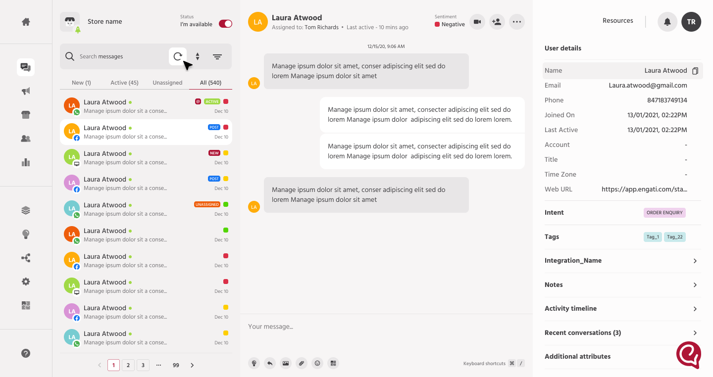
I restructured the inbox around explicit, color-coded status tags New, Active, Unassigned, Post so an agent could scan the queue and understand the state of every conversation without opening a single one. I paired this with dedicated filter tabs (New, Active, Unassigned, All) so agents could work a specific slice of the queue instead of scrolling past conversations that didn't need them yet. The goal was to move the cognitive work of triage out of the agent's head and onto the screen.
Surfacing sentiment where decisions actually happen
I brought sentiment previously buried inside individual conversations up into the agent's working view, flagging negative-sentiment chats directly. Combined with the status tags, this meant an agent glancing at their queue could immediately spot the conversation that was both unassigned and negative: the exact combination most likely to turn into an escalation if left too long.
Giving agents context without a second click
On opening a conversation, I designed a persistent right-hand panel with user details, intent, tags, and recent conversation history all visible alongside the chat itself. Agents no longer had to leave the conversation or dig through separate screens to understand who they were talking to and why the context traveled with the conversation instead of being one more thing to go find.
Building it to scale, not just to ship
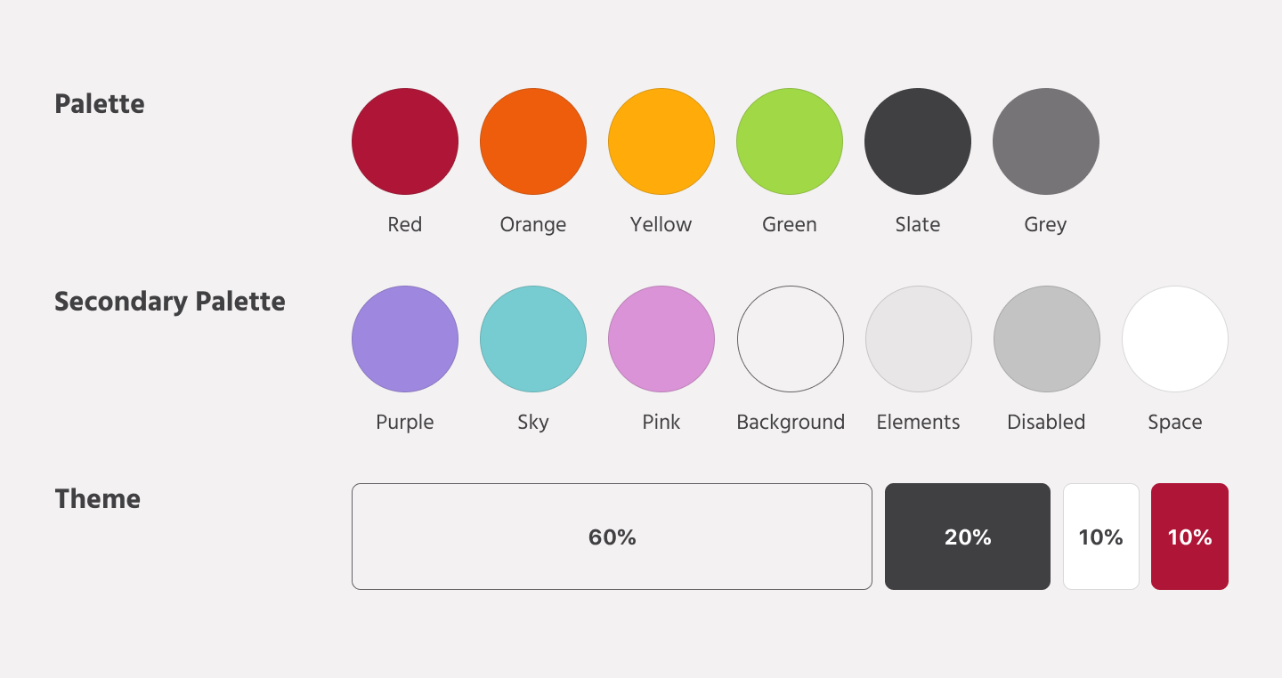
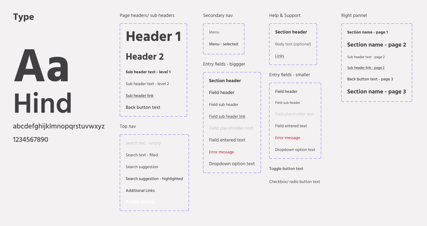
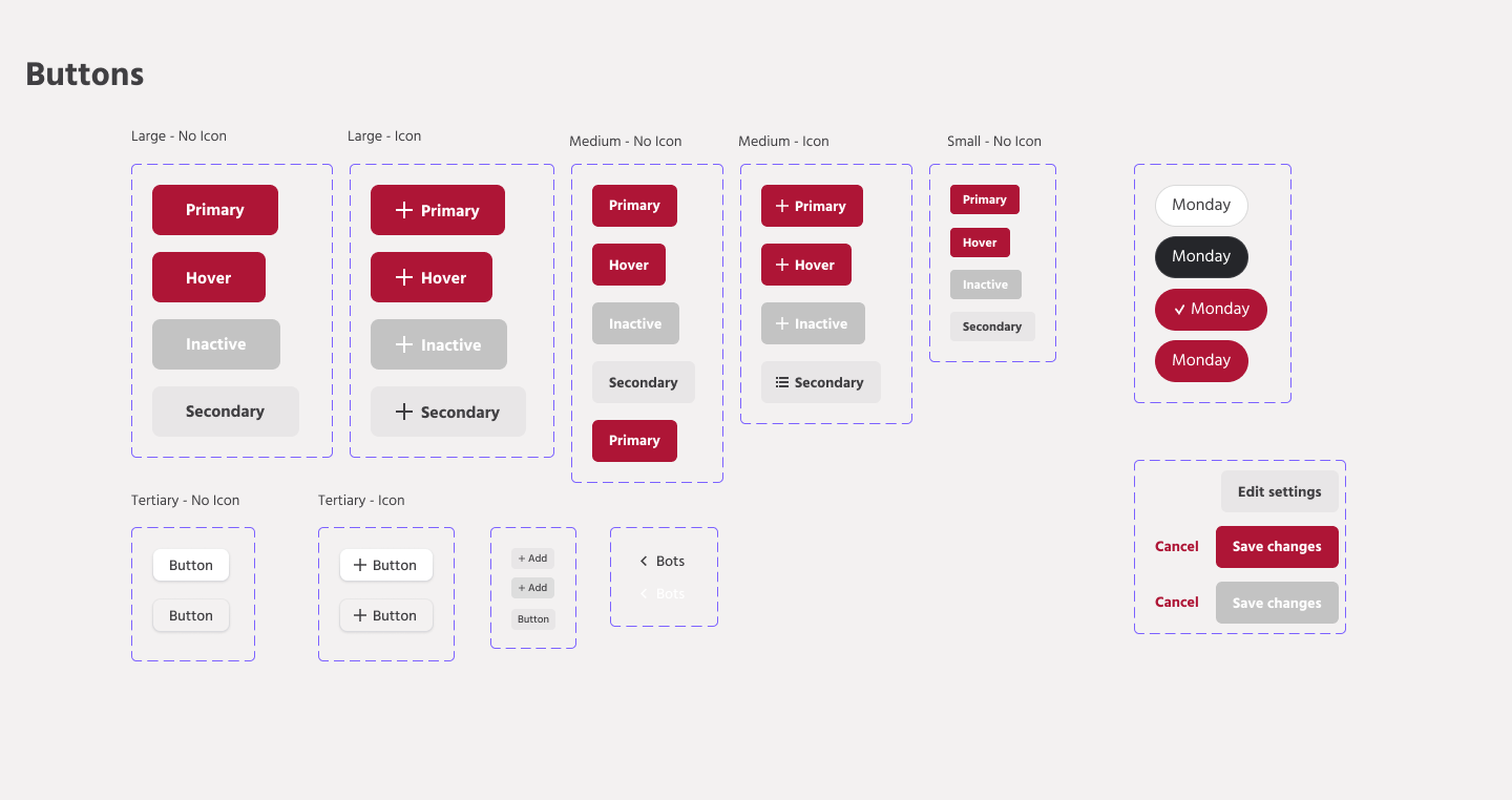
Because this redesign touched status indicators, tags, and panel components that would need to reappear consistently across other parts of the product, I extended Engati's design system alongside the workflow itself formalizing the color palette, type scale, and component patterns used for status states so future releases could reuse the same visual language instead of reinventing it. This was deliberate: a triage system only works if its visual cues stay consistent everywhere an agent encounters them.
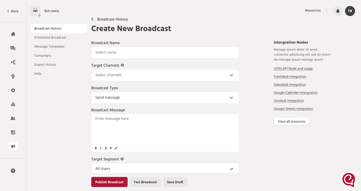
Extending the same thinking to broadcasts
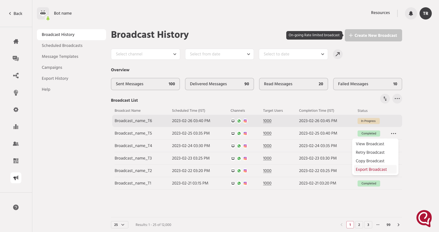
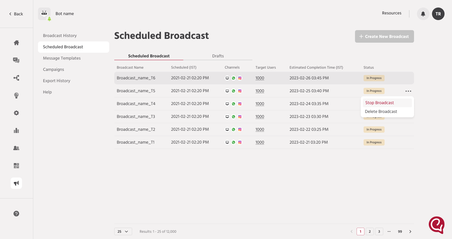
The inbox wasn't the only place where agents were flying blind until it was too late. Sending a broadcast message meant uploading a contact list often an Excel or Word file with hundreds or thousands of rows and hoping it went through cleanly. If a phone number was malformed or a country field was blank, agents often didn't find out until the send had already failed or partially failed, well after the moment they could easily fix it.
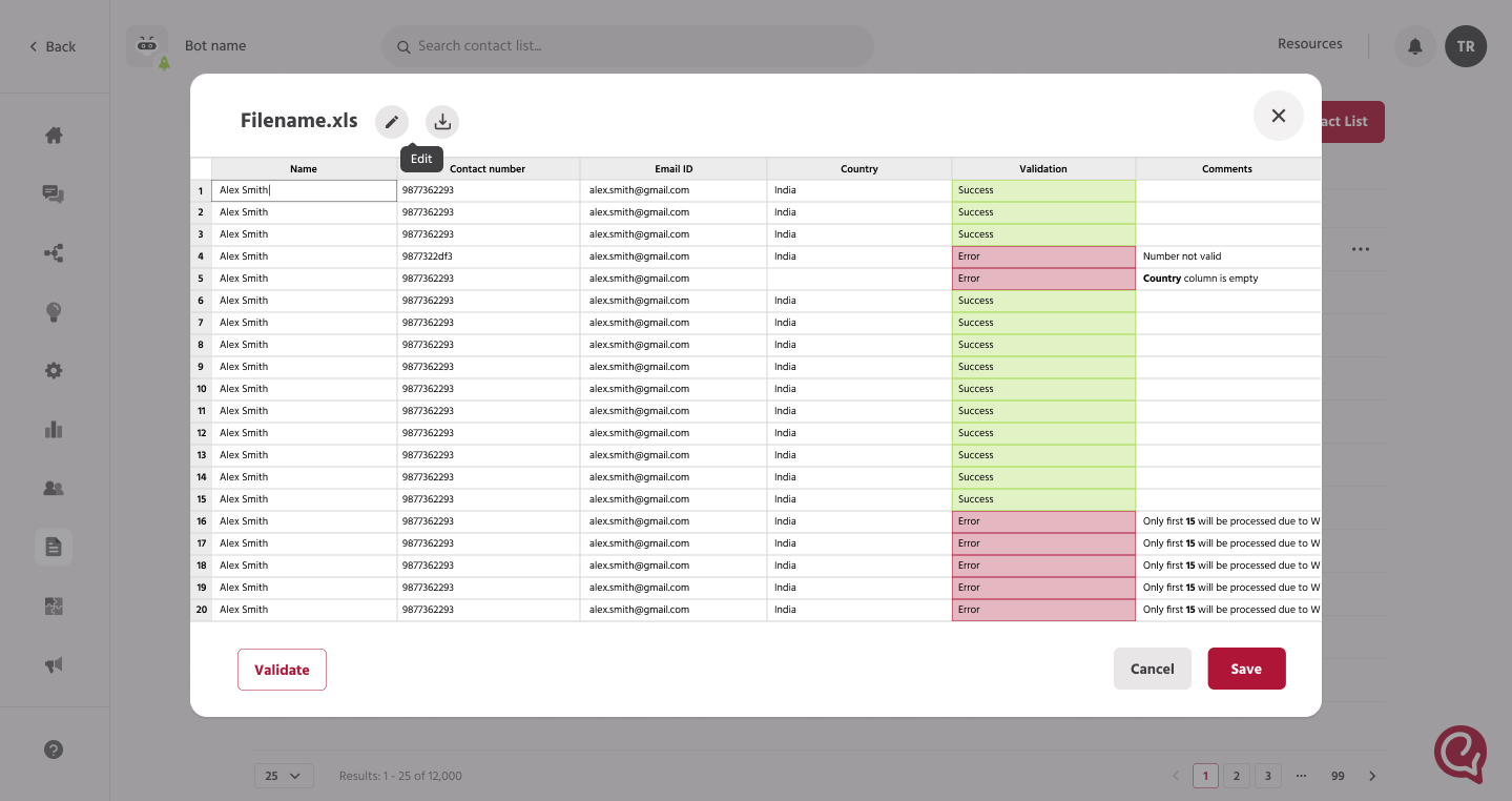
I applied the same principle from the inbox redesign here: surface the state of the data before the action, not after. I designed an inline editor inside the "Import Contact List" flow that validated every row on upload and returned a per-row verdict directly in the table Success in green, Error in orange with a specific reason like "Number not valid" or "Country column is empty," and a distinct flag for rows that would be held back due to batch limits, so agents could see exactly which contacts wouldn't go out in this send and why. A running error count sat above the action buttons, so an agent never had to scroll the full list to know whether the file was clean.
The harder problem was what to do with a file that was almost right. Instead of forcing an all-or-nothing choice, I let agents validate, review flagged rows inline, fix what could be fixed, and send only the batch that had actually passed. Large lists were broken into processable batches rather than one monolithic send, so a handful of bad rows in a 12,000-contact file no longer blocked the other 11,995 from going out.
Reusing the same status colors and tag language from the inbox redesign was deliberate. An agent who'd learned that orange meant "needs attention" in their conversation queue didn't have to relearn that logic here the design system did the work of making a completely different workflow feel like part of the same product.
The foundations everything was built on
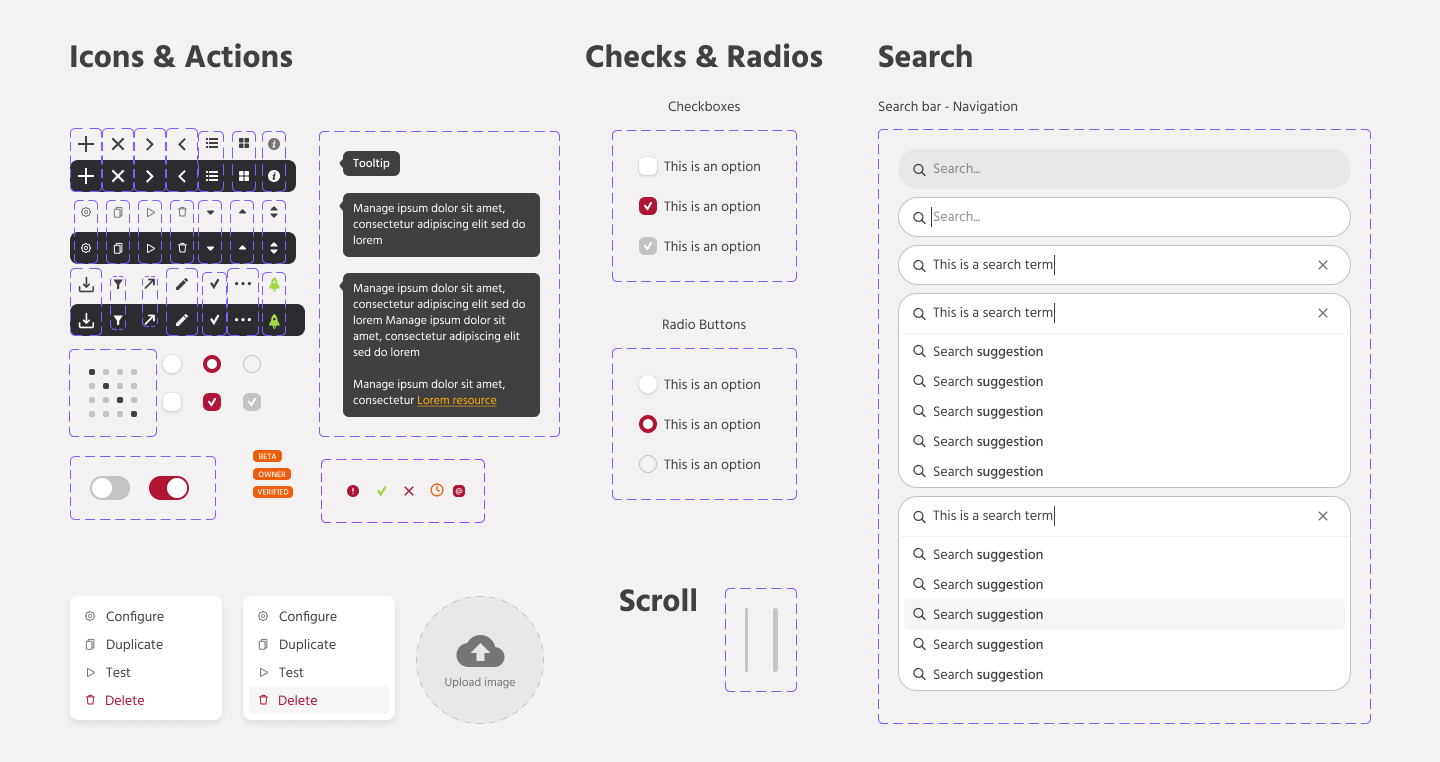
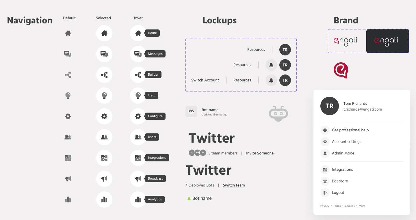
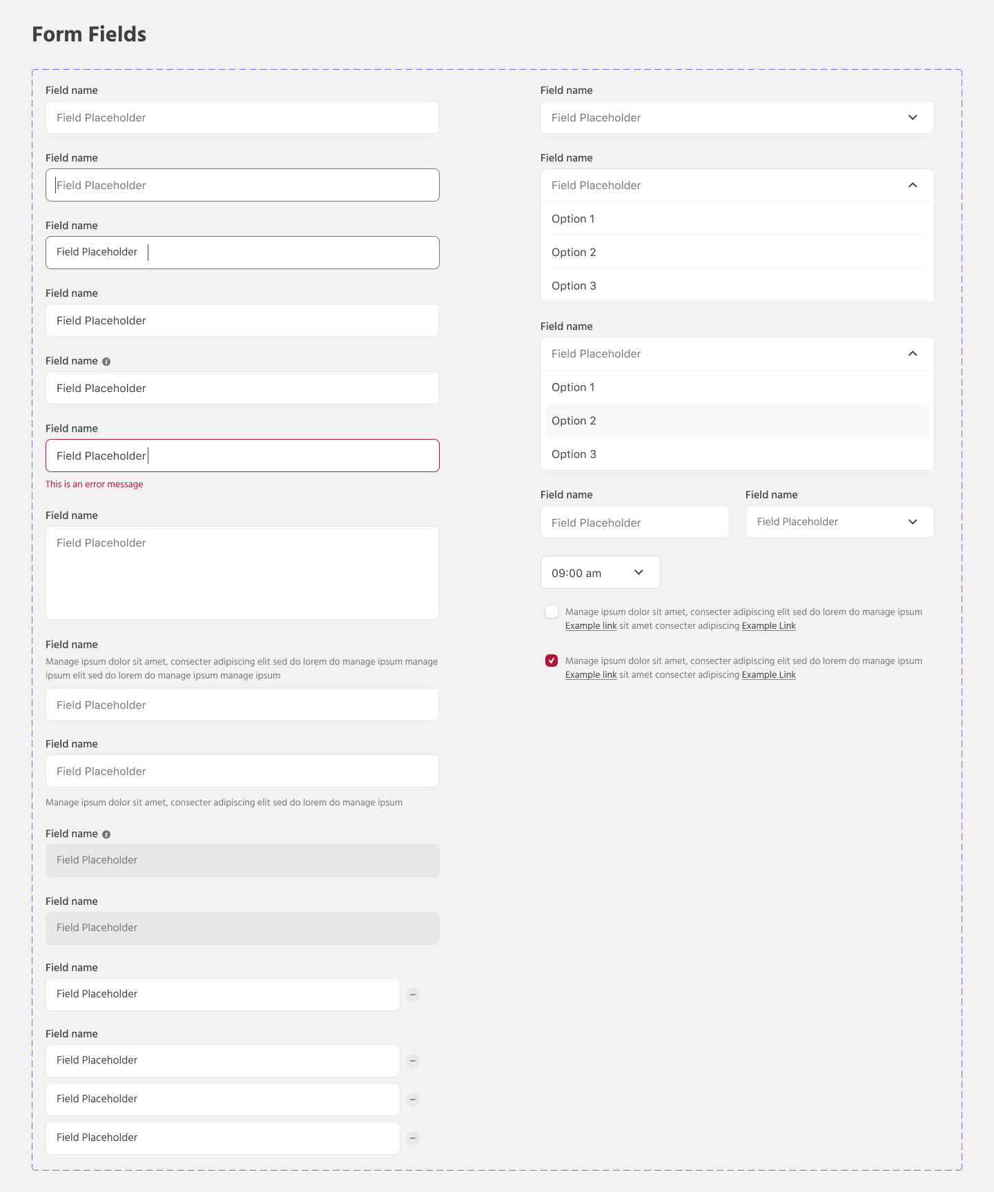
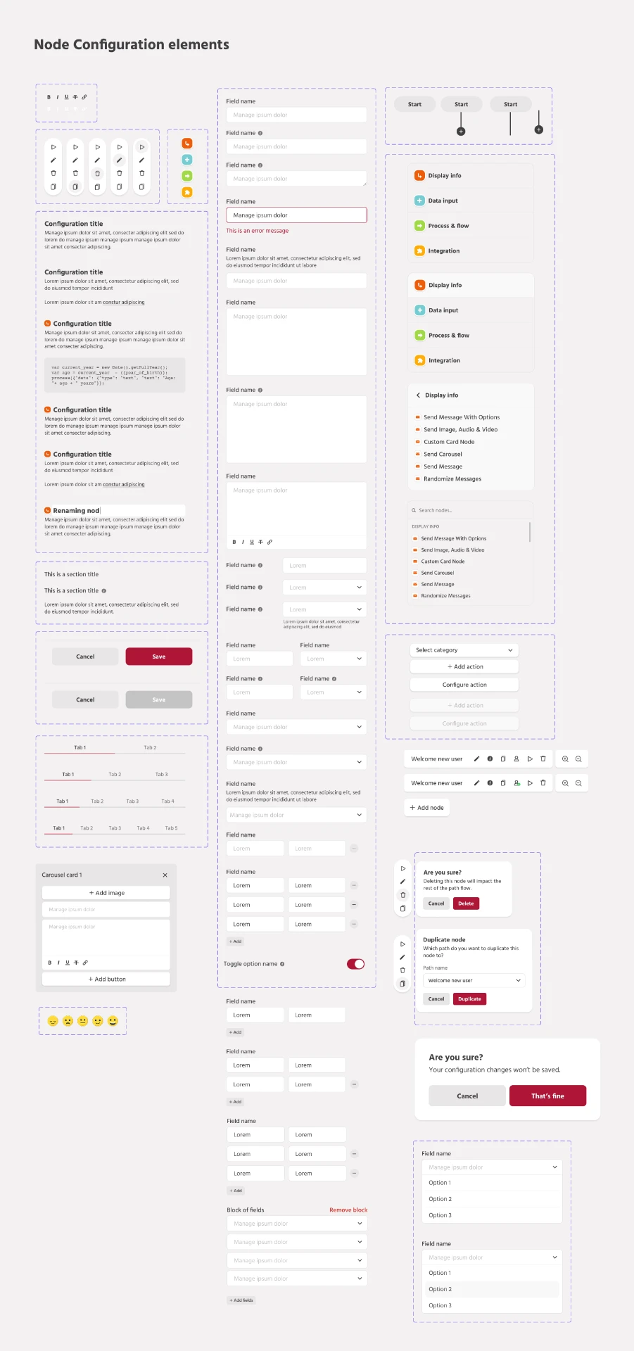
Before the inbox could be redesigned, the platform needed one shared vocabulary. These are the library plates: colour, type, grid, controls and the builder specific components that every screen in this case study is assembled from.
The work, screen by screen
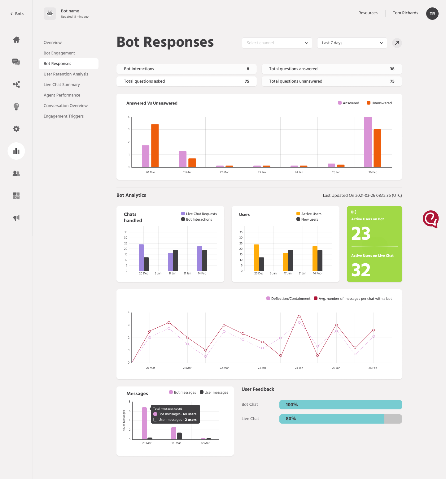
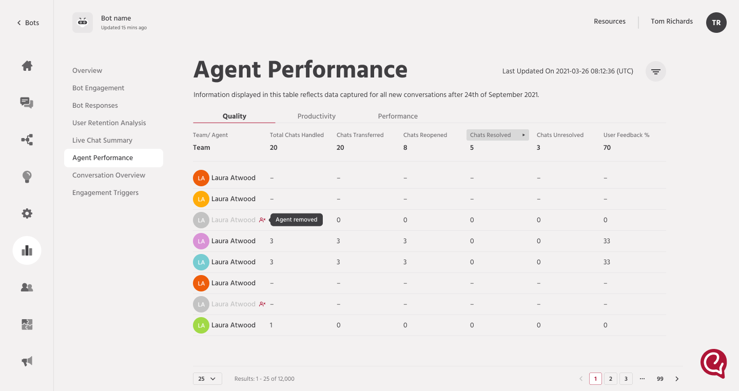
Scroll horizontally through the delivered interfaces from the triage inbox to the broadcast and analytics surfaces built on the same design system.
Evidence, not instinct
The redesigned inbox, and the broadcast import flow that followed it, shipped as part of a broader platform release. The clearest signal that it worked wasn't a dashboard metric it was the drop-off in the kind of confusion and complaints that used to reach the support and product teams directly. Agents stopped asking which conversations needed attention, and stopped discovering broken contact lists only after hitting send, because the interface was finally answering those questions before they had to ask.
What I'm most proud of isn't the tag system or the panel layout individually it's that the redesign came from evidence, not instinct. The instinct on a busy inbox is to add more filters and hope agents find their way. The actual fix was almost the opposite: reduce what agents had to figure out for themselves, and let the interface state the obvious thing out loud.
The best triage interface isn't the one with the most options it's the one where the right conversation is already at the top before you've had to think about it.
That principle make the state of the work visible before someone has to go looking for it is one I've carried into every workflow-heavy screen I've designed since.